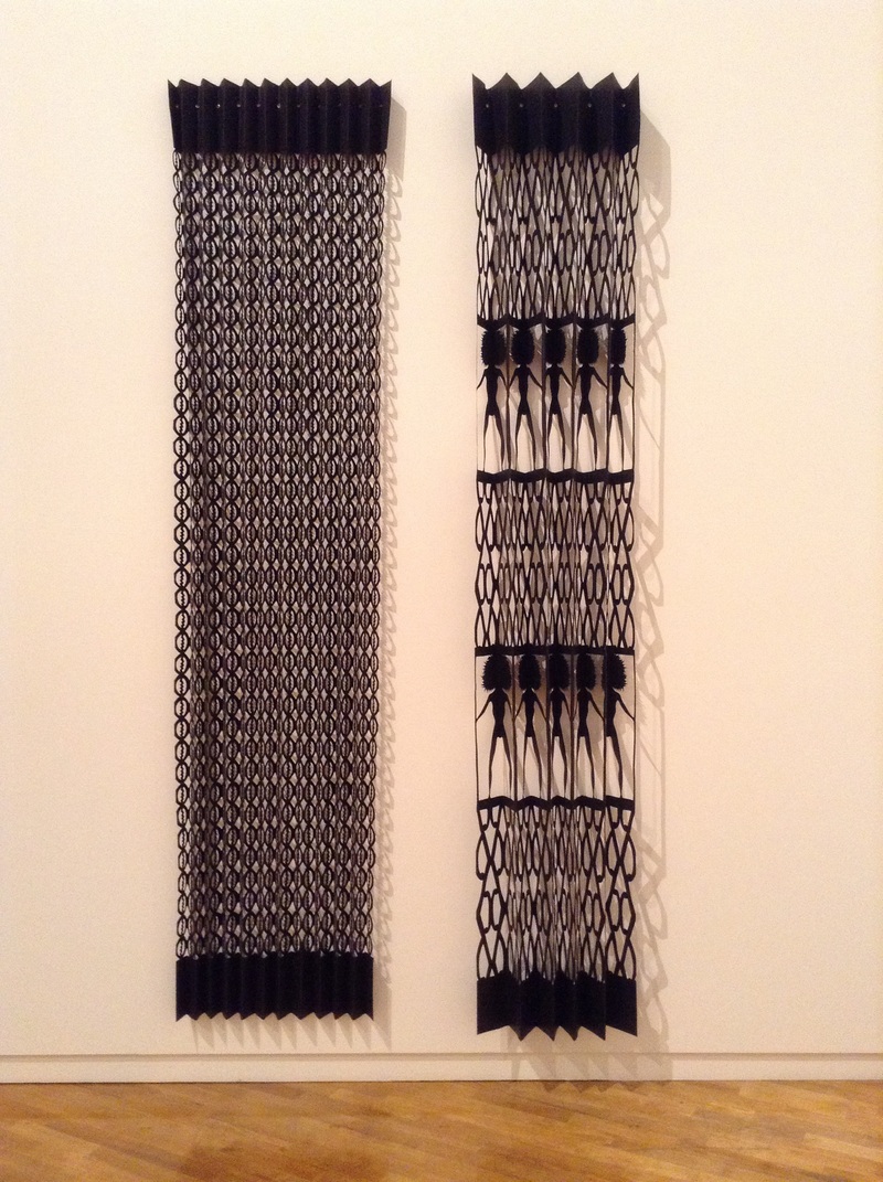
I met a Darwin artist on the second day of the symposium whose passion in art is the paper making, first love, then printing on it, second love. Her work looked beautiful from a catalogue she showed me. I'll bet it is even better in the real. 1/3 Vickers Street, Parap, NT, 0820. www.nomadart.com.au . Also on Museum and Art Gallery Northern Territory
|
Again, the following is what I took from the speakers. Artists from both yesterday and today, and I guess in general, seem to emphasise the use of experimentation or play and the importance of this in taking work from ordinary to extraordinary. Internal Structures Patsy Payne - articulate and wonderful. Payne sees the physical body as our most constant companion that holds our consciousness. Referring to Paul Valery's 1943 essay 'some simple reflections on the body' she produced work such as 'Inside out' using the physical body's form of internal structures of patterning and networking to create her 'blood work' of edges and boundaries. The aim of her shapes is to reflect the permeability of letting the outside world in and the inside world out. She uses a variety of materials and has chosen structural materials among other things .e.g. steel in 'inside out' that rusted quickly in the humidity of Bangkok, where she created the work, to then be able to take prints from the structures.
Richard Harding - uses print media, analogue and digital processes to explore gay masculinity, identity and its relationship to the closet, using the reproduced image. He finds a curiosity in the way we present ourselves, where tension arises between public and private disclosure and the com modification of homosexuality. He has referred to two texts ie Eve Kosofsky Sedgwick's (theorist) 1999 'Epistemology of the Closet' which Harding describes as a liberating read and Gilles Deleuze's 1968 'Difference and Repetition 4 illusions of representation'. Harding covers many concepts in his work such as the search for print sameness aligning with homo 'normality', patterns of behaviour, the invisible man ie, straight acting by gay men, speech, posture, gesture. He has created a striking work "This is not a drill" loaded with meaning and yet crisp and clean and refined imagery. He mentioned something like reproduction always creates anguish.....this work looked powerful and I would have loved to see it in the gallery. Hunters and Collectors: active history
Joan Ross - creates animation work and using printmaking as one of a number of vehicles to further her animations. One of the signatures of her work is using the fluorescent colour yellow. She describes the colour as having both positive and negative effects on her and uses it as a layered meaning or representation of fear, safety, alienation and as a connotation of colonisation. She references paintings by John Glover and Jospeh Lysart having enjoyed Lysarts work for many years and always imagining the artwork to come to life. Eamon Donnelly - I loved, loved loved this presentation. He was a child of the 80s like I was and the memories of warmth and sun came flooding back while his slide show moved through images he had from his huge collection of food packaging, books, souvenirs signage and advertising he has collected from that time period. The bright and gaudy colours commonly used in the 80s, that became unpopular after the eighties, considered kitsch and ugly, I guess until now, like Joan Ross is a signature of his work. He has a strong and successful illustration background and has created a digital archive called 'The Island Continent'...look at it. His current photographic work has focused on the local milkbars of the Australian suburbs and the good memories it represents for him and many others, the families that ran them (often immigrants) and what this era represented. Workshop studios Next were three representatives of contemporary print workshops and the roles they play. 1. Negative Press - independent publishing house in Melbourne. Fred spoke of a few of the joys and challenges of their journeys. One example was the seemingly ongoing trouble getting the artwork of Stuart Ringholt off the ground. I can't remember the name of the work but I am going to say I saw it and appreciated when it was exhibited at Brisbane's IMA at the end of last year. 2. Tooth and Nail - in Adelaide born from the vision and persistence of Jake and Cassie. It appears the space is strengthening over time. They have established Print Cult - art for the people. Look it up. 3. Canopy Art Centre - In Cairns and represented by Theo Tremblay who seems to be the heart of the space. There seemed to be a ripple of respect for this man throughout those attending the symposium. I don't know much about him but when people react toward a person like this, he must have done some good along the way. Analogue Nostaligia Tony Kanellos - Adelaide artist spoke of his interest in the Museum of economic botany and began to collect post cards from the Edwardian era (1900-1914) with images on the front of the cards of different aspects and activities within the botanical gardens. He found as much interest in the notes written on the back of the cards which he likened to the personal e-mails of today being the cheapest and most efficient way to communicate. Clint Harvey - #strongarmpress Works at Design College Australia and began The Bacon Factory in Fortitude Valley, Brisbane, keeping letterpress print alive with contemporary flavour. He mentioned his belief in the physicality of this printing method helps to slow the pace of modern society and develop the mind while re-inventing analogue processes. Actually I looked up Clints website before going to the symposium and on his page is a fantastic quote that I wish every artist from every discipline could string around their neck, with no explanation required...'Designers are meant to be loved, not understood' Fabien Barral Penny Roger - a unique and intriguing character so passionate for her written art that you cannot help but be inspired to create when listening to her jump from her topic sideways and back again, while being entertaining and delivering her love for writing and her publishing business The Good Copy (co founder).
There was an array of speakers today and I took something from each one Dr Ann Stephen spoke of how the Bauhaus model impacted Australian art particularly on printmaking and how threads can be drawn from initial artists that brought the model to Australia such as Ludwig Hirschfeld Mack, Harry Seidler, Anni and Joseph Albers to Contemporary artists such as Emily Floyd's (Whitlam era) abstract work referencing the Bauhaus toys as an example or Alison Alders decorative patterns reference Anni Albers weaved designs. Dr Stephens referred to them as something similar to " reinvented pleasures for different uses ". Celestial Bodies Kate Sweetapple - incorporates data from varied sources from the white Pages to knowledge from individuals of other disciplines to create maps that seek to record more than what a map is traditionally referred to for. Maps are beautiful in and of themselves and the idea of recording the unnecessary elements of life for the sake of fleeting interests is really interesting and holds that element of play. Vanessa Berry - is interested in plotting or mapping personal and collective history but in the form of zines - where she is comfortable for experimentation. Currently she has focused on 'place' and particularly places within her life that she feels may be forgotten or unusual, or things that begin to stand out before they disappear because they are no longer kind on the eyes. Berry assembles her own interpretations of place as a literary and image assemblage. One of her works was part of the length of Parramatta road and the 'varicose vein' it is sometimes looked upon as. Brian Robinson - his work is focused on finding his place in the world by starlight and the rhythm of the stars. A spiritual journey reflected from his Torres Strait Islander heritage that encourages people to look towards the heavens for seasonal, social and spiritual lessons. His work is stunning. There is a collision of signs and symbols from his traditional heritage and modern day influences. His work in stunning stunning stunning. Down to Earth Hertha Kluge-Pott - spoke of the need to organise the physical world around her into layers to create inward order and harmony. She spoke of breaking open the energies and connections to nature and reaching inwards, outwards and into the heavens. Her work reflects the very energetic vibrations and magnetic fields of earth. She spoke of the earth and elements of it e.g. The maleleuca tree as a close personal friend and she was having an intimate emotional response to it. There was a particularly beautiful work called 'Wanderlust', 1994 that was a reflection of her father and herself. Her father who took her into the bush and showed her how to be quiet, listen and see. It seemed magical. Chris De Rosa - opened with what I think was a section of a Bjork track and images of floating seaweed and ocean that is a part of her everyday. Italian background, ocean and gardening. Her work was a response to many things but to me stood out the Herbal remedies found in her aunties handbooks and the work that image linked the herbal plant with the body part I suspect that plant affected in the body. She worked with images found in the Lino flooring of domestic settings and sea sponges found in her front yard. Physical being in her own world. I loved the way she worked. John Wolseley - what a character! opened up by asking something similar to, do we impose our mental constructs or do we listen to and work with what is out there? He collaborates with nature, allowing nature in a variety of methods make its mark. For example, throwing his 'expensive' paper into the environment and collecting it weeks later then working with the marks left on the paper. He uses his'nature prints' or 'feral methods of mixing mediums' to make the gap between nature and paper an intimate connection. Inspirational work. Very beautiful.
|
Archives
February 2019
KyLIE spindlerBrisbane visual artist Categories
All
|
 RSS Feed